Candy Wrapper Design
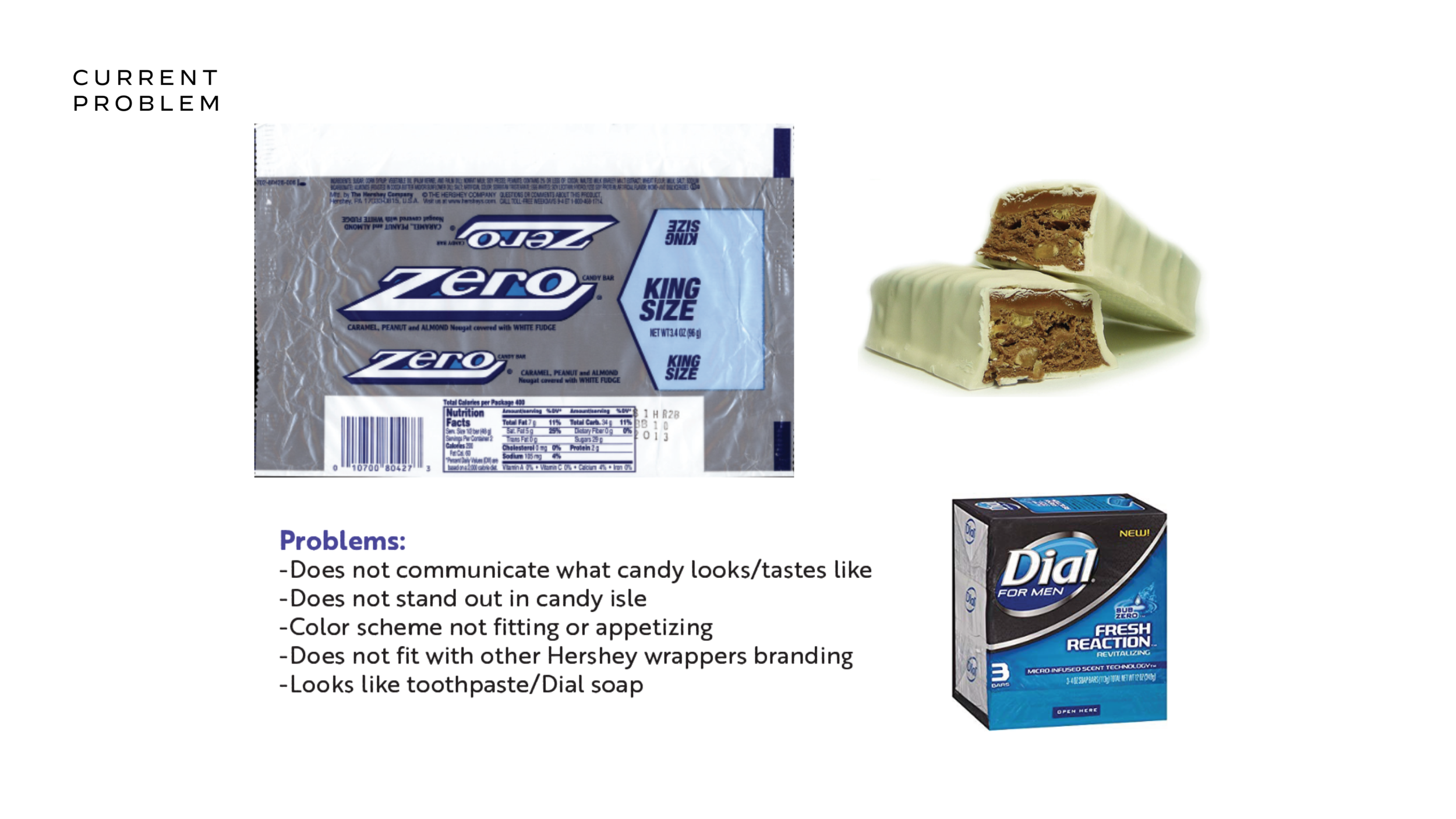
For this project I had to select a candy bar with a poor wrapper design and recreate it. I chose to look at Hershey's ZERO candy bar because I thought the wrapper design could be greatly improved. I see many problems with the current wrapper, such as the color scheme and lack of information about the candy it displays to potential consumers.
I realized that the ZERO bar is not very popular and after doing some research learned that not most people have never had one, or even knew what it looked/tasted like. Having never had one myself, I bought one to try. I chose a whole different look and color scheme because the candy bar was white fudge with peanuts, caramel and nougat, which the current wrapper does a poor job of communicating.
I chose tan, gold and brown to portray the peanuts, caramel and nougat. I gave the package a white fudge stripe across the bottom and put a picture of the candy bar on the outside, similar to what Hershey's does with its Reese’s Fastbreak bar. This will help people who have never had a ZERO bar to get and idea of what it looks/tastes like.
I submitted my new design to the Hershey company via their ideas page on their website and they got back to me saying the marketing/packaging departments would review it. Although it is a long-shot it that they would ever use it for production, I think it is still cool to share my ideas with Hershey.